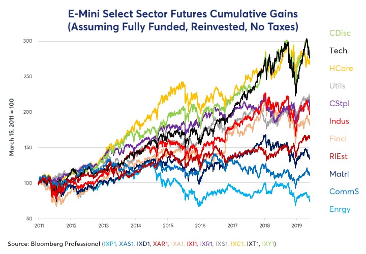
So, what explains their relative performance? Why did they move almost in tandem until 2014 and why have they diverged since?
This paper answers these questions with a quantitative analysis, calculating the sensitivity (beta) of each of the 11 Select Sector Indices with respect to seven fundamental and financial factors using daily data over eight years. These factors include:
- Short-term rates: the one-day change in Fed fund futures expectations one year out.
- Long-term rates: the one-day change in the 30Y-2Y (often expressed as 2Y30Y) yield curve slope.
- Inflation expectations: the one-day change in the 10Y U.S. break-even inflation spread: 10Y nominal bond yield – the yield on 10Y Treasury Inflation Protected Securities (TIPS).
- Equity volatility: the one-day change in the VIX Index of S&P 500® options volatility.
- Crude oil prices: the one-day change in the price of West Texas Intermediate Crude Oil.
- Industrial metals: the one-day change in the prices of Dr. Copper.
- U.S. dollar: the one-day change in the Bloomberg Dollar Index.
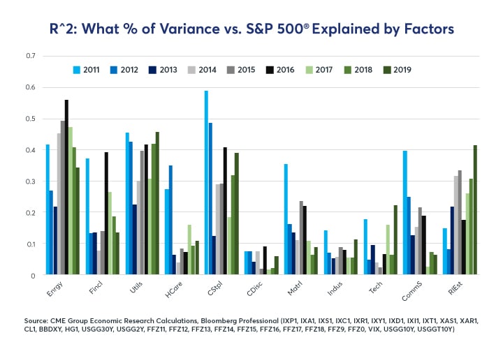
The dependent variable in our regression models is the performance of a given E-mini Select Sector futures contract less the performance of E-mini S&P 500® futures. As such, the focus is on what drives the relative performance of sectors versus the index. Our models explain roughly half of the variance vs the S&P 500 from energy, utility and consumer staples stocks. They explain about one-third of the daily variance in financial services, communication services and real estate and about one-quarter of the variance in materials stocks. Our models have a more difficult time explaining the variance of health care, consumer discretionary, technology, and industrial stocks (Figure 2).
Short-Term Rates
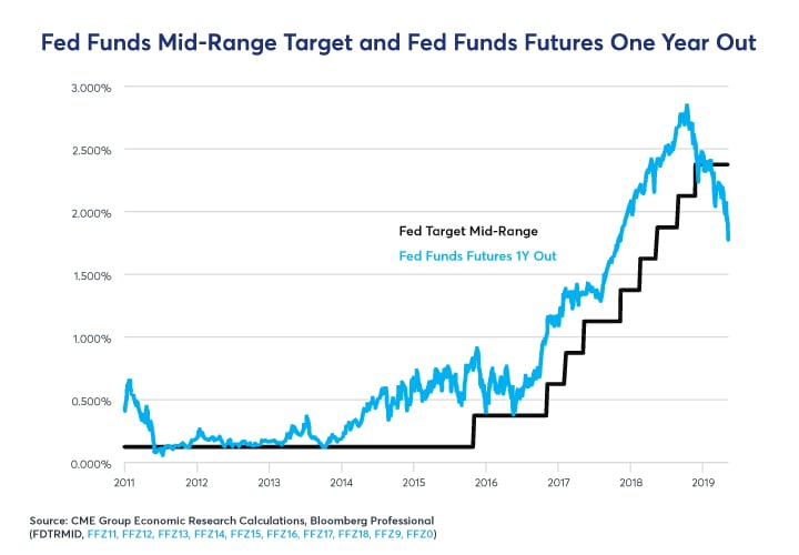
One reason why the various equity sectors turned in reasonably similar performances between 2011 and 2014 was because short-term interest rates barely moved and hence gave very little incentive for any given sector to outperform or underperform the market. That began to change in late 2014 as investors started to anticipate the eventual Federal Reserve (Fed) tightening which began in earnest at the end of 2016. Since then, anticipated Fed rate moves have been on a wild ride with one-year-forward expectations varying from a Fed policy rate of nearly 3% by late 2019 (anticipated in the fall of 2018) to current anticipation of several Fed rate cuts back to around 1.75% by this time next year (Figure 3).
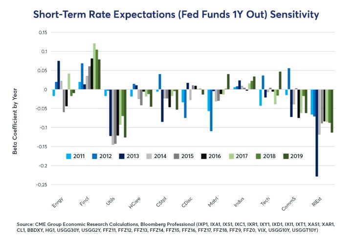
The various sectors show widely different responses to changing anticipations in the short-term interest rate market. Financial stocks love higher rates, and their beta with respect to Fed rates has increased over time. Banks and brokers suffered during the long period of near-zero interest rates and rejoiced when the Fed began normalizing policy. They are less enthused about the prospect that the Fed might soon cut rates.
Utility and especially real estate stocks trade in the opposite manner. Utilities pay high dividends and trade a bit like bonds: low interest rates increase the net present value of their future cash flows; high interest rates do the opposite. For real estate, low interest rates encourage consumer borrowing, lifting the demand for property; high interest rates do the opposite. Both sectors tend to be highly leveraged as well. Consumer staples and communication services stocks show a weaker negative correlation with short-term interest rates while most other sectors appear to be indifferent (Figure 4).
If Fed fund futures expect 100 basis points (bps) more in rate hikes over the next year, Financial stocks might outperform by as much as 7%, all else equal, while utilities and real estate stocks might underperform the S&P 500® by 10% or more.
Long-Term Rates
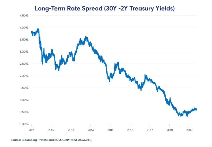
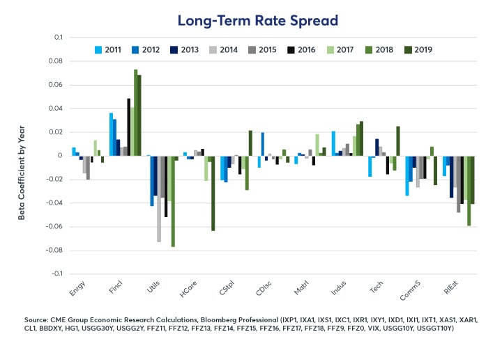
It’s a similar story for long-term interest rates. To minimize multicollinearity, we observe long-term interest rates as a spread over short-term interest rates by taking the yield on the 30Y U.S. Treasury and subtracting the yield on the 2Y U.S. Treasury (Figure 5). The flattening of the yield curve explains to some extent why financial stocks didn’t perform especially well after the Fed began lifting rates. On the one hand, higher short-term interest rates were good for banks and brokers’ profits. On the other hand, a flatter yield curve narrowed the banks’ margins on long-term loans. Industrial firms have a weaker positive sensitivity to the yield curve slope: a steep yield curve is a harbinger of strong future economic performance; a flat yield curve often signals the opposite.
Utilities, real estate, consumer staples and communications services stocks respond negatively to yield curve steepening and positively to yield curve flattening. For these companies, higher long-term interest rates are no better than higher short-term rates. In recent years, health care stocks have also begun to show a negative beta to the yield curve as well. The other sectors appear to be largely indifferent to the relative level of long-term interest rates (Figure 6).
Inflation Expectations
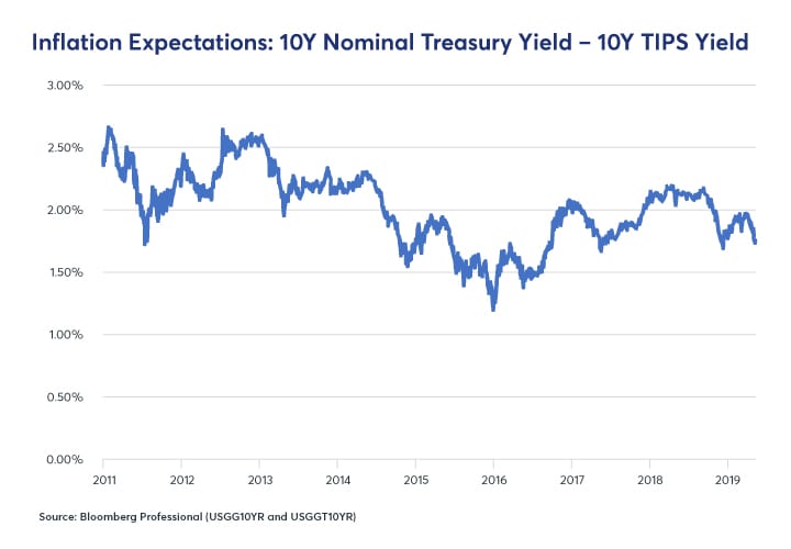
We measure inflation expectations as the difference between the yield on the nominal 10Y U.S. Treasury and the yield on 10Y Treasury Inflation-Protected Securities (TIPS) (Figure 7).
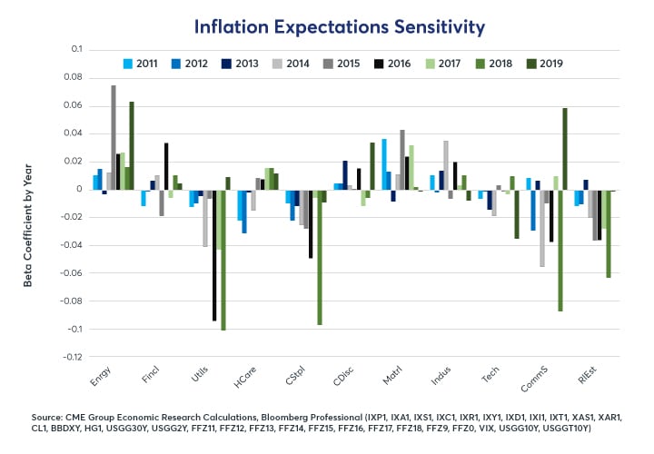
Changing inflation expectations also exert an influence on the sectors’ relative performance. Higher inflationary expectations are typically quite negative, particularly for utilities, consumer staples and real estate as they imply the likelihood of higher short-term interest rates in the future. For energy and materials stocks, the causality probably works in reverse. Higher oil and metals prices cause a widening of inflation expectations which benefits holders of energy and materials stocks as well as the owners of inflation-protected U.S. Treasuries relative to the owners of non-inflation-protected (nominal) Treasuries (Figure 8).
Utilities, consumer staples and real estate stocks tend to show a negative sensitivity to increased inflation expectations. For them, higher inflationary expectations are a harbinger of expectations for tighter monetary policy (or, absent that, higher long-term interest rates) in the future. A 100-bps rise in inflation expectations could send utility stocks as much as 10% lower versus the index and would likely pull down real estate and consumer staples stocks by smaller amounts.
Volatility
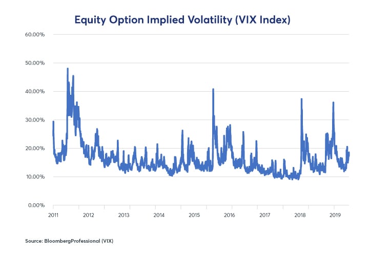
Implied volatility on equity options is highly unstable. After a massive volatility spike in 2011 around the time of the government shutdown and threatened default on U.S. debt, equity option volatility has been extremely subdued for the most part. Since January 2018, however, that has changed as implied volatility on equity index options has begun to creep higher (Figure 9).
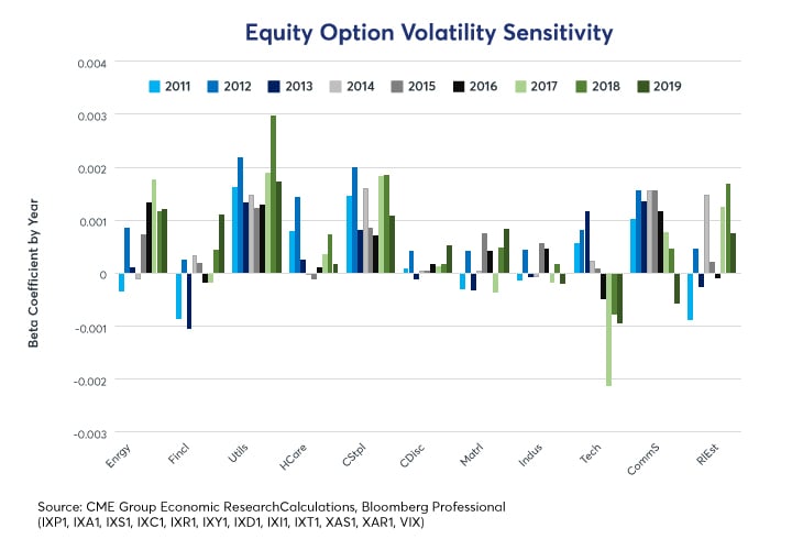
The various sectors show a widely different response to changes in option volatility. Generally speaking, the lower volatility sectors tend to outperform during volatility spikes: these include utilities, consumer staples, communication services and real estate – the same four sectors that show negative sensitivity to higher interest rates and inflation expectations. This is probably because short-term interest rates tend to fall when the equity market tanks and volatility spikes. By contrast, falling volatility tends to encourage higher short-term interest rate expectations. Curiously, energy stocks also tend to outperform during volatility spikes as well.
Financial stocks reacted negatively to higher volatility in 2011-13 – memories of the financial crisis were still fresh. More recently, however, financial shares have begun to react more positively to spikes in volatility (on a relative basis to the market as a whole). For technology stocks, the story is the opposite: back in 2011 when tech stocks were, if anything, undervalued, spikes in volatility didn’t seem to bother them much. Over the last four years, as tech stocks soared, they have been hit hard especially when volatility spikes. Herein lies a warning: if tight Fed monetary policy produces a rise in volatility as it has in the past, highly valued tech stocks could be especially vulnerable to declines (Figure 10).
Oil Prices
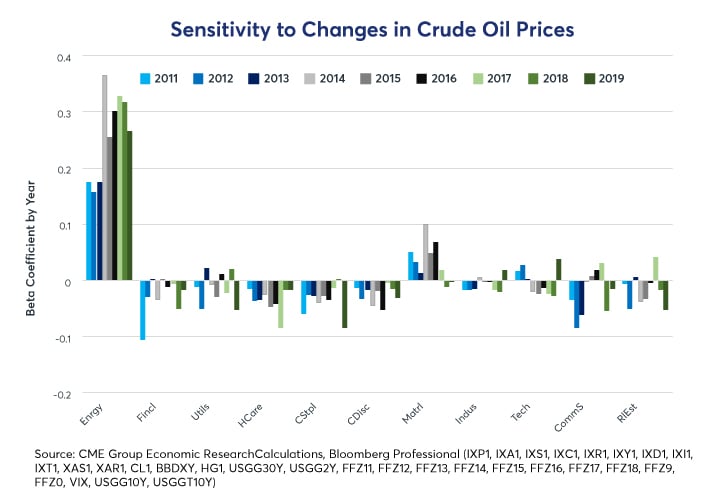
Not surprisingly, oil prices are the dominant driver of the over and underperformance of Select Sector Energy futures. In 2011-13, the beta coefficient on oil prices was around 0.17 – so a 10% rise in oil would likely have produced about a 1.7% outperformance of Select Sector Energy futures with respect to the S&P 500®. Since the crash in oil prices in 2014, that relationship has strengthened to closer to 0.30. As such, a 10% move in oil prices now tends to send energy stocks about 3% higher or lower versus the index (Figure 11). What’s curious is that the energy companies seem to be unable or unwilling to diminish this risk through hedging.
Materials stocks tend to correlate slightly positively to crude oil prices as well. The other sectors all show a slight tendency to underperform the index in the face of higher energy prices.
Dr. Copper
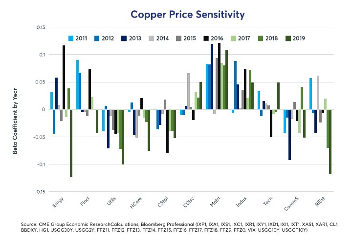
Just as higher oil prices are great news for energy companies, higher copper prices are a boon to mining company stocks, which dominate the materials sector. Higher copper prices are also a positive signal for industrial companies – which is a bit paradoxical since industrial metals are among an industrial firm’s input costs. What matters more than the cost of copper though is the signal that copper sends with regard to the state of the global economy. Higher copper prices signal stronger global growth, especially for China and emerging markets. For industrial firms, that seems to override any cost concerns.
Likewise, the signal that copper sends about the direction of the global economy also impacts utility, health care, consumer staples, and real estate stocks. Stronger growth isn’t great news for these sectors since it implies the possibility of higher interest rates going forward.
The U.S. Dollar
A stronger U.S. dollar (USD) tends to be bad news for commodity prices and hence for both energy and materials stocks. Tech firms tend to be more at ease with a strong USD. The other sectors demonstrate mixed and inconsistent responses to changes in the U.S. dollar.
The U.S. dollar has been a strong currency since 2011, which explains to some degree why oil and copper prices have fallen. Expanding U.S. budget deficits, a likely slowdown in U.S. growth and the possibility that the Fed might ease policy could set the dollar on course to become a weak currency during the 2020s. If that’s the case, it could buffer any negative impacts on energy and materials stocks.
Utility, communication services, consumer staples and real estate stocks tend to react negatively to higher short-term and long-term U.S. interest rates as well as anything that might send them higher (increased inflation expectations, higher copper prices and falling volatility). Financial services stocks tend to do the opposite: outperform on higher interest rates and increasingly now on volatility spikes.
Energy and materials stocks tend to benefit from higher oil and metals prices, respectively, and both sectors tend to be hurt by a stronger U.S. dollar.
Technology stocks largely march to the beat to their own drummer, but they don’t mind a stronger USD and they are becoming increasingly vulnerable to extreme downside performance during volatility spikes (and conversely to bigger-than-average increases in value when volatility subsides).
Health care stocks appear to be largely immune from the sorts of macroeconomic factors that we have analyzed here but they can still be strongly impacted by political factors, including efforts at health care reform, that are not covered in this paper. On a purely economic basis, health care stocks are diversifiers from other macro factors: higher rates, a weaker dollar, changing inflation expectations, materials or energy prices; people will want health care no matter what.
Consumer discretionary stocks are relatively immune from the sorts of economic and financial factors that we have analyzed here. Higher rates, a weaker dollar, increasing oil prices or falling copper prices: the rich don’t care. They continue to consume discretionary items regardless and most of them don’t require credit to do it.
Lastly, all of the sectors moved together between 2011 and early 2014 largely because none of these macro factors were giving strong signals: short-term interest rates weren’t about to move; the yield curve was steep, energy prices were high but stable as well metals prices and volatility had subsided. The crash in energy and metals prices in 2014-16, the subsequent Fed tightening cycle and the beginnings of a rise in volatility have sent the various sectors on widely different paths.
-
Recommended For You
All examples in this report are hypothetical interpretations of situations and are used for explanation purposes only. The views in this report reflect solely those of the author(s) and not necessarily those of CME Group or its affiliated institutions. This report and the information herein should not be considered investment advice or the results of actual market experience.
Read original article: https://cattlemensharrison.com/forces-that-drive-equity-select-sectors/
By: CME Group

