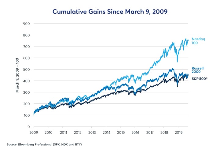
Fortunately, there is no time limit on how long markets can keep rising, and just because the bull market is ten-and-a-half-years old doesn’t mean its anywhere near its end (although it might be). But there are several warning signs that may signal an end to the good times. These include:
- Falling corporate earnings
- A narrowing of the rally to only large cap stocks
- Widening credit spreads
- Rising implied volatility on equity index options
Falling Corporate Earnings
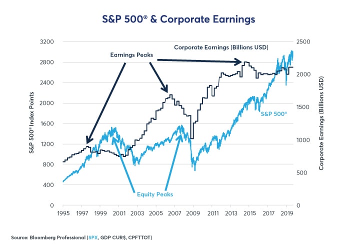
The two most recent bull markets went through two phases. Phase one is intuitive: corporate earnings rise and stock prices rise with them. Phase two is more complex: corporate earnings begin to fall but stocks rise anyway. In the 1990s, phase one lasted until 1997 while phase two took over during the last three, erratic years of the bull market. In the next bull market, phase one lasted from 2003 until early 2006, then phase two from mid-2006 until the October 2007 peak (Figure 2).
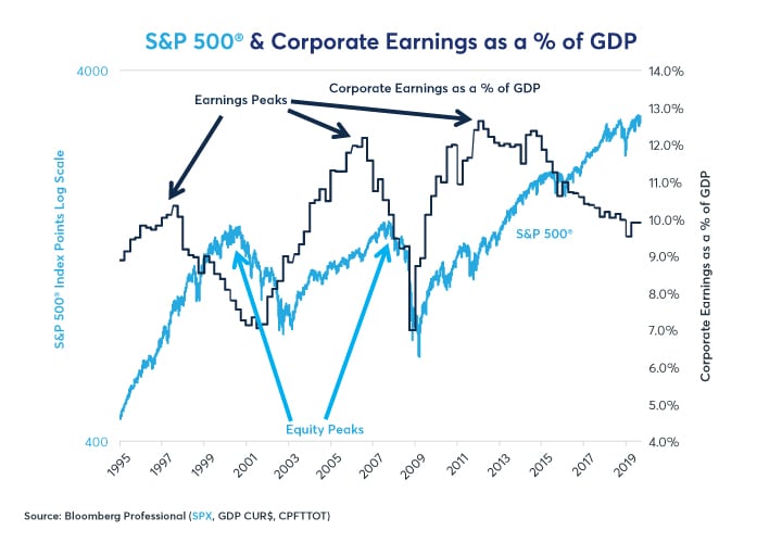
This time around, phase one lasted from 2009 to 2014. Since then corporate earnings, when seen in dollar terms, have entered a sort of stage 1.5. Earnings haven’t fallen dramatically but they have been stagnating and angled slightly lower for years even as stocks soared. Viewed as a percentage of GDP, however, corporate earnings have been plunging since the end of 2014 as nominal GDP has far outpaced gains in earnings even as the S&P 500 closed in on its all-time high from 2000 as a % of GDP (Figure 3).
Given that the tax cut is behind us, the labor market has tightened dramatically, and short-term interest rates have gone from zero to positive, corporate earnings might remain under further downward pressure. That said, the previous two bull markets demonstrated the simple fact that falling earnings does not necessarily mean stocks will begin falling soon – although another bear market is inevitable someday. Nevertheless, falling earnings and rising equity prices are a sign that the rally may be getting into its later stages and investors may want to think about how to hedge risk and where to move for safety when the time comes.
Rally Concentrates in Large-Cap Stocks
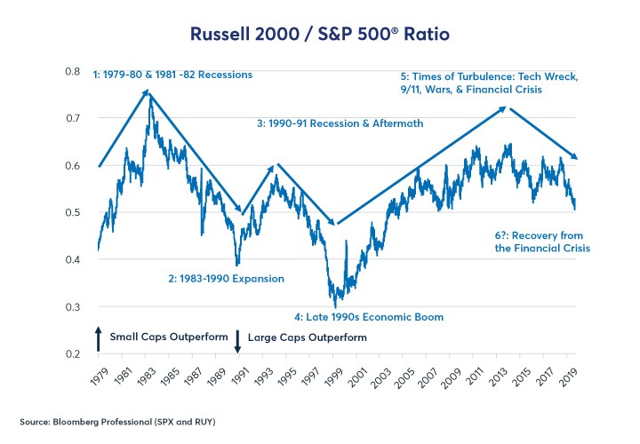
During the 1980s and 1990s bull markets, small caps outperformed in the early stages of the rallies as they had during the recessionary periods that preceded them. However, as those expansions matured, small-cap stocks hit a wall and large-cap stocks outperformed. During the 2001 recession, small-cap stocks once again outperformed just as they had during previous periods of market turbulence. What made the 2003-2007 bull market different was that small-cap stocks kept outperforming (except towards the peak of the expansion in 2005-2007) and continued to do so until 2013 – four years into the current bull market. Since 2013, large caps have outperformed, especially during the past two years (Figure 4). This doesn’t spell the immediate end of the bull market, but it is another factor, however imperfect, to watch for signs that the current bull market is maturing from its mid-stage to old age.
Equity Sectors Begin to Diverge
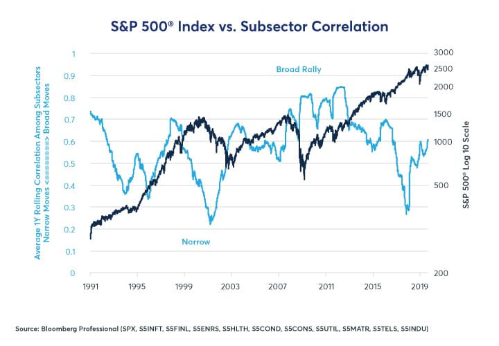
The S&P 500 breaks down into 11 major subsectors: consumer discretionary, consumer staples, energy, financials, health care, industrials, IT, materials, telecom, utilities and real estate. Typically, during bear markets, they all fall more-or-less together (except utilities which benefit from lower interest rates). Likewise, during the early stages of bull markets, a rising tide usually lifts all boats. The correlation among the sectors remains high. As the bull market matures, however, that correlation begins to break down. Many sectors begin to underperform and go their own way, while the rally becomes more-and-more concentrated in just a select group of sectors. In the 1990s and in the current rally, technology stocks have come to dominate. Often, this concentration of performance leads to disappointment among investors who have bid up share prices in favored industries to levels that cannot be justified by earnings. Eventually, some groups of investors get nervous about the ability of these favored companies to hit their earnings targets and sell. The bear market begins.
The current bull market experienced extraordinarily high correlations among sectors from 2009 to 2012 and more moderate ones until 2015. By the time the market peaked in 2018, those correlations had broken down to their lowest levels since 2001, when the market was beginning a 50% decline. That said, the correlation among market sectors is an imperfect indicator. It also dipped in 1993, and 1994 was mainly a year of sideways trading for equities, and then the market soared from 1995 until 2000. Moreover, the internal correlation picture has improved a great deal since Q4 2018 but this was mainly because most sectors plunged that quarter. The recovery has been uneven and focused on just three sectors: IT, health care and consumer discretionary (Figure 5).
Widening Credit Spreads
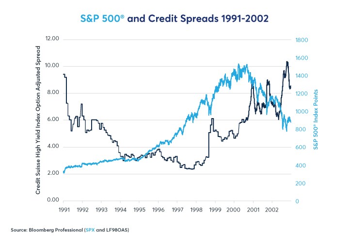
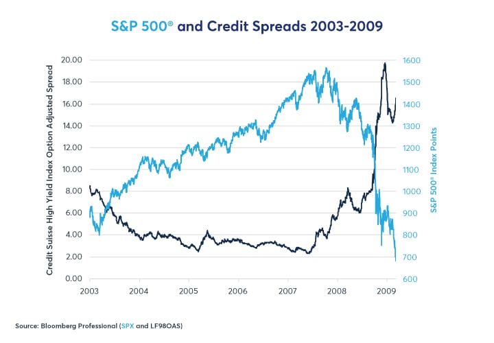
Credit is the lifeblood of the economy. When corporations, individuals and governments can readily borrow money, the economy almost inevitably expands. By contrast, when credit dries up, the economy and eventually equity markets often hit the skids. In both bull markets in the 1990s and 2003-2007, credit spreads began widening well before the equity market peaked – sending a clear warning the equity investors spent years ignoring – until it was too late, the economy was in a recession and equity prices collapsed (Figures 6 and 7).
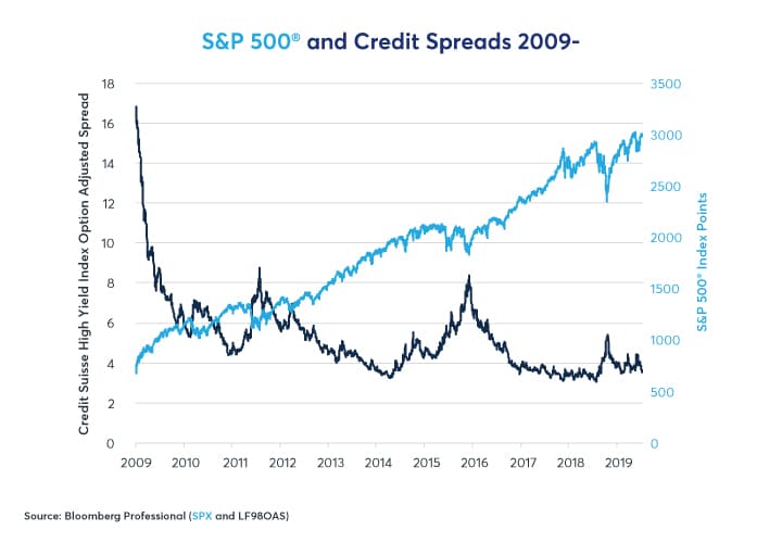
Credit spreads blew out twice during the current equity rally, once in 2011, around the time of the budget dispute between Congress and the White House, and again in 2015. The 2015 episode coincided with the collapse in commodity prices. When oil prices fell from $100/barrel to $26 between late 2014 and early 2016 that caused a significant widening of spreads in the energy sector but didn’t derail the overall recovery nor the equity market. Crude oil production accounted for about 1.5% of US GDP at the time and the value of that production dipped to 0.5%. There was real economic harm in the energy sector which experienced a wave of layoffs and sharp reductions in capital investment but for the other 98.5% of the economy, lower energy prices were a boon.
Credit spreads began widening again in October 2018. Every subsequent low in high-yield bond spreads over Treasuries has been greater than the previous one (Figure 8). So far, there hasn’t been a massive blow out in high-yield spreads but watch for 6-7% over Treasuries. That was the level that seemed to trigger job losses, economic downturns and bear markets in 2000 and 2007.
Credit spreads themselves are driven to a large extent by monetary policy. Easy monetary policy tends to produce an environment for narrowing/tight credit spreads. Tight monetary policy eventually tends to translate into wider credit spreads. Credit spreads also exert an influence on monetary policy as well: narrow spreads eventually beget Fed tightening, whereas wide spreads often force Fed easing.
Check out our articles on:
Rising Volatility
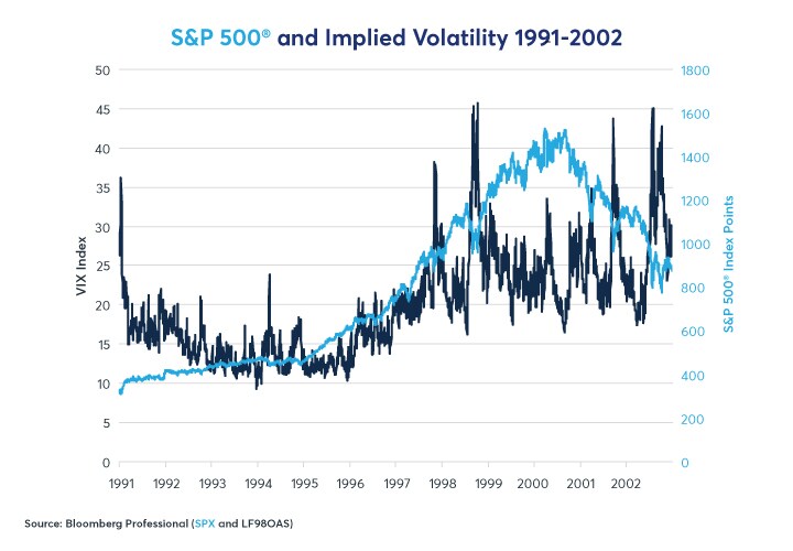
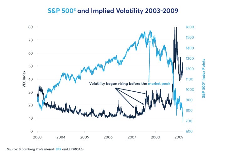
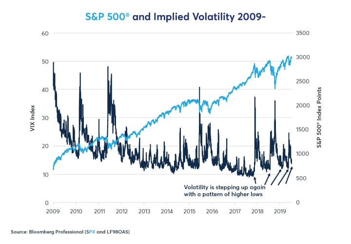
Like credit spreads, volatility appears to move in cycles related to monetary policy. Also, very much in the same vein as widening credit spreads, rises in the cost of equity options (increased implied volatility) often presages eventual equity bear markets. Broadly speaking, the equity index options market has two states: a low-volatility state (1993-1996, 2004-2006 and 2011-2018) that is often associated with the mid-stages of economic expansions and equity bull markets. It also has a high volatility state (1989-91, 1997-2003 and 2007-2011) that is associated with the end of bull markets and subsequent equity bear markets/economic recessions.
During the low-volatility state, S&P 500 index options often average around 12-14% implied volatility and typically range from 8.5% implied volatility to perhaps the high 20s or low 30s during occasional market selloffs. When equities are in their high volatility state, usually after a Fed tightening/yield curve flattening, equity index options average around 23-28% with a floor around 17-20% and frequent spikes up to the 40-50% range and occasionally higher. Importantly for investors, the transition from the low- volatility to the high-volatility state often comes well before the peak in the equity market. This is to say that, towards the end of their lives, equity bull markets tend to become more volatile and erratic even as stocks continue to work their way higher.
For example, the VIX began rising in 1997 (Figure 9) but the equity market didn’t peak until 2000. In 2007 the gap was much shorter. Nevertheless, volatility began to rise February 2007 – about eight months before the market peaked (Figure10).
The question for investors this time is, are we already in a pattern of rising equity option volatility? After volatility spiked in January 2018, it never came back down to its previous lows, perhaps anticipating the sharp correction in Q4 2018. Since the beginning of 2018, every new low in equity option volatility has been higher than the previous low.
Rising volatility also explains the paradox of why equities can still rise even as credit spreads widen towards the end of bull markets (Figure 11). Equities can be understood as a long call option on a corporation with a strike price of zero and unlimited life/no expiry. Increased volatility increases their value – so, a rise in market volatility can potentially be bullish for stockholders in the short term because rising volatility increases the value of options. By contrast, corporate bonds can be understood as a short-put option on the corporation: if all goes well the owners of a corporate bond collect their premium (get their money back with interest) but if the corporation fails, they lose some or all their money. As such, increased uncertainty causes corporate bond prices to fall and yields to rise –widening the gap between their yields and those of use treasuries.
Bottom Line
- Equity indices have recovered to near-record highs
- But the bull market is looking less and less robust
- Volatility is increasing, and credit spreads are widening
- Corporate earnings are falling
- The rally in equities has become narrow
- If the equity rally continues, it will probably become more volatile, more susceptible to large, sharp corrections
-
Recommended For You
All examples in this report are hypothetical interpretations of situations and are used for explanation purposes only. The views in this report reflect solely those of the author(s) and not necessarily those of CME Group or its affiliated institutions. This report and the information herein should not be considered investment advice or the results of actual market experience.
Read original article: https://cattlemensharrison.com/equities-tell-tale-signs-of-an-aging-bull-market/
By: CME Group

