Fortuitously, there is no time limit on how long markets can keep rising, and just because the bull market is 10 years old, doesn’t mean it’s anywhere near being over (although it might be). But there are six key warning signs that might signal an end to the good times.
They are:
- Falling corporate earnings.
- A narrowing of the rally to only large cap stocks.
- A breakdown in correlation among equity sectors.
- High consumer confidence.
- Widening credit spreads.
- Rising implied volatility on equity index options.
1. Falling Corporate Earnings
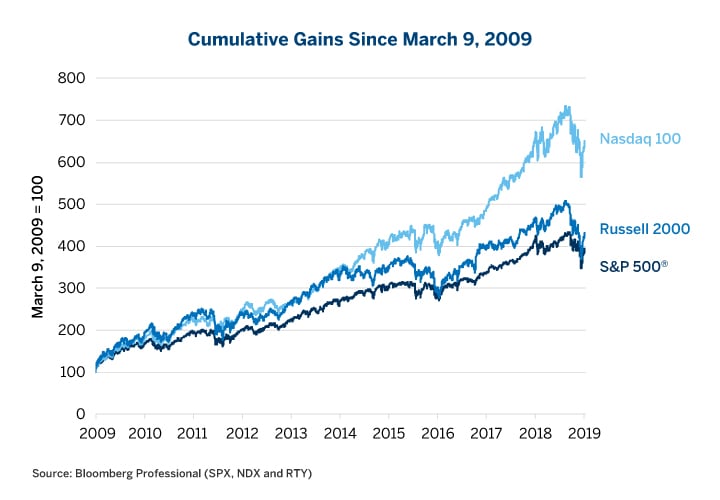
The last two bull markets went through two phases. Phase one is intuitive: corporate earnings rise, and stock prices rise with them. Phase two is a little less intuitive: corporate earnings begin to fall but stocks rise anyway. In the 1990s, phase one lasted until 1997 while phase two took over during the last three of the decade, erratic years of the bull market. In the second bull market, phase one lasted from 2003 until early 2006, and phase two from mid-2006 until the October 2007 peak (Figure 2).
This time around, phase one lasted from 2009 until 2014. Then we began phase 1.5 – a plateau in earnings that lasted from 2014-18. Energy company earnings dipped in 2015 and 2016, and then rebounded. Overall, outside of energy, earnings largely stagnated. They got a nice boost from the corporate tax cut in 2018 but that’s a one-time deal.
Given that the tax cut is behind us, the labor market has tightened dramatically, short-term interest rates have gone from zero to over 2% and there’s a good chance that earnings are peaking and will begin to decline. In fact, worries over earnings were a major contributing factor to the recent equity market correction. That said, the recent decline may be nothing more than that—a counter-trend move in a long-term rally. And as the previous two bull markets demonstrated, the simple fact of falling earnings does not necessarily mean that stocks will begin falling soon – although another bear market is inevitable someday. Nevertheless, falling earnings and rising equity prices are a sign that the rally may be getting into its later stages and investors may want to think about how to hedge risk and where to move for safety when the time comes.
2. Rally Concentrates in Large Cap Stocks
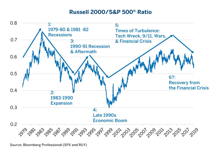
During bull markets in the 1980s and 1990s, small caps outperformed in the early stages of the rallies as they had during the recessionary periods that preceded them. However, as those expansions matured, small-cap stocks hit a wall and large-cap stocks outperformed. During the 2001 recession, small-cap stocks once again outperformed just as they had during previous periods of market turbulence. What made the 2003-2007 bull market different was that small-cap stocks kept outperforming (except towards the peak of the expansion in 2005-2007) and continued to do so until 2013 – four years into the current bull market. Since 2013, large caps have outperformed, but not by much – at least until recently. Only in the last few months have large-cap stocks really outdistanced small caps by a substantial amount (Figure 3). This doesn’t spell the immediate end of the bull market, but it is another factor, however imperfect, to watch for signs that the current bull market is maturing from its mid-stage to old age.
3. Equity Sectors Begin to Diverge
The S&P 500® comprises 11 major subsectors: consumer discretionary, consumer staples, energy, financial, health care, industrial, technology, materials, communication services, real estate and utilities. During bear markets, they all typically decline more-or-less in concert (except utilities which benefit from lower interest rates). Likewise, during the early stages of bull markets, a rising tide usually lifts all boats. The correlation among the sectors remains high. As the bull market matures, however, that correlation begins to break down. Many sectors begin to underperform and go their own way as the rally becomes more-and-more concentrated in just a select group of sectors. In the 1990s and in the current rally, for example, technology stocks have come to dominate. Often this concentration of performance leads to disappointment among investors who have bid up share prices in favored industries to levels that cannot be justified by earnings. Eventually, some group of investors gets nervous about the ability of these favored companies to hit their earnings targets and sells. Hence, the bear market begins.
The current bull market experienced extraordinarily high correlations among sectors from 2009 to 2012 and more moderately until 2015. By the time the market peaked in 2018, those correlations had broken down to their lowest levels since 2001, when the market was beginning a 50% decline. That said, the correlation among market sectors is an imperfect indicator. Correlation also dipped in 1993, and 1994 was mainly a year of sideways trading for equities, and then the market soared from 1995 until 2000. Moreover, the internal correlation picture has improved a great deal as the equity market corrected over the past few months (Figure 4).
4. Consumer Confidence is High
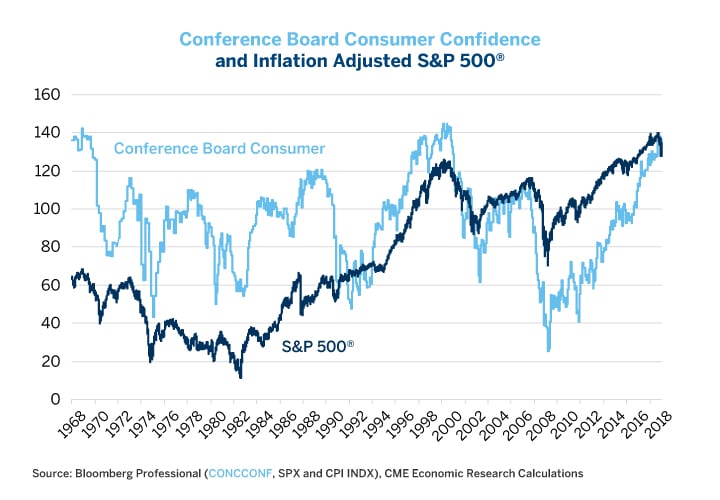
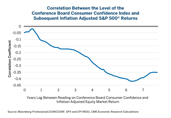
Even better than investor confidence surveys are measures of consumer confidence. Paradoxically, high consumer confidence is often terrible news for equity performance. Peaks in consumer confidence in the late 1960s and in 2000 translated into awful inflation-adjusted equity market performance in subsequent years (Figure 5).
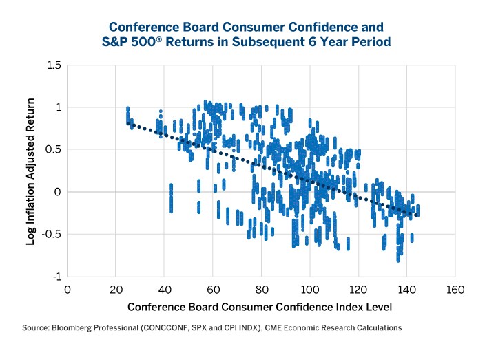
Bear in mind, however, that consumer confidence is more of a long-term indicator (five to seven years out) than a short-term indicator. For example, confidence levels achieved exceptional heights in 1997 but stocks didn’t peak until 2000. Nevertheless, measuring over any five-to-seven-year period after previous peaks in consumer confidence, equity returns were at best mediocre and often downright negative, especially when measured on an inflation-adjusted basis (Figures 6 and 7).
This is bad news for investors today. Consumer confidence has soared to highs not seen since the end of the 1990s and the year 2000. This doesn’t necessarily mean that equities have peaked already or will do so in the near future, but it might indicate that investors are in for a poor return over the next, say, seven years or so.
5. Widening credit spreads
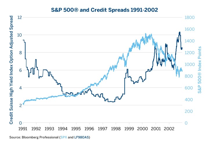
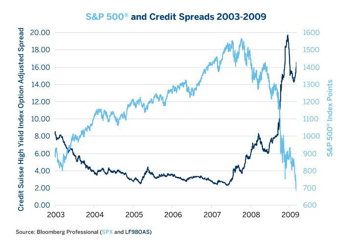
Credit is the lifeblood of the economy. When corporations, individuals and governments can borrow money easily, the economy almost inevitably expands. By contrast, when credit dries up, the economy, and eventually equity markets, often hit the skids. In both the 1990s bull market and in the 2003-2007 rally, credit spreads began widening well before the equity market peaked – sending a clear warning signal that equity investors ignored for years – until it was too late and the economy was in a recession and equity prices collapsed (Figures 8 and 9).
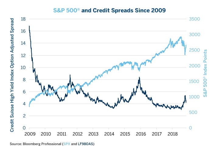
Credit spreads blew out twice during the current equity rally, once in 2011, around the time of the budget dispute between Congress and the White House, and once in 2015. The 2015 episode coincided with the collapse in commodity prices. When oil prices fell from $100/barrel to $26/barrel between late 2014 and early 2016, that caused a significant widening of spreads in the energy sector but didn’t derail the overall recovery nor the equity market. Crude oil production accounted for about 1.5% of U.S. GDP at the time and the value of that production dipped to 0.5%. There was real economic damage in the energy sector, which experienced a wave of layoffs and sharp reductions in capital investment. But for the other 98.5% of the economy, lower energy prices were a boon.
Credit spreads began widening again in October 2018. This widening, however, didn’t anticipate the recent correlation in equity prices so much as it coincided with it. That said, credit spreads remain narrow by historical standards and are not even close to signaling that an economic downturn is imminent. One possibility is that the equity market goes on to hit new highs but that credit spreads don’t achieve new lows – or maybe even widen further. This would be a warning side of a late-stage bull market.
Credit spreads themselves are driven to a large extent by monetary policy. Easy monetary policy tends to produce an environment of narrowing/tightening credit spreads. Tight monetary policy eventually tends to translate into wider credit spreads. Credit spreads also exert an influence on monetary policy as well: narrow spreads eventually beget Fed tightening, whereas wide spreads often cause Fed easing.
6. Rising Volatility
Like credit spreads, volatility appears to move in cycles related to monetary policy. Also, very much in the same vein as widening credit spreads, increases in the cost of equity options (rising implied volatility) often presage eventual equity bear markets. Broadly speaking, the equity index options market has two states: a low-volatility state (1993-1996, 2004-2006 and 2011-2018) that is often associated with the mid-stages of economic expansions and equity bull markets. It also has a high- volatility state (1989-91, 1997-2003 and 2007-2011) that is associated with the end of bull markets and subsequent equity bear markets/economic recessions.
During the low volatility state, S&P 500 index options often average around 12-14% implied volatility and typically range from 8.5% implied volatility to perhaps the high 20s or low 30s during occasional market selloffs. When equities are in their high-volatility state, usually after a Fed tightening/yield curve flattening, equity index options average around 23-28%, with a floor around 17-20% and frequent spikes up to the 40-50% range and occasionally higher. Importantly for investors, the transition from the low- volatility state to the high-volatility state, often comes well before the peak in the equity market. This is to say that, towards the end of their lives, equity bull markets tend to become more volatile and erratic even as stocks continue to work their way higher.
For example, the VIX began rising in 1997 (Figure 11) but the equity market didn’t peak until 2000. In 2007, the gap was much shorter. Nevertheless, volatility began to rise in February 2007 –about eight months before the market peaked (Figure 12).
The question for investors this time is: Are we already in a pattern of rising equity option volatility? After volatility spiked in January 2018 it never came back down to its previous lows, perhaps anticipating the sharp correction in Q4 2018.
That said, there were many volatility spikes in the late 1990s (August and October 1997, August-October 1998). Each time the market sold off 10-20% it rallied back to new highs – at least until 2000 when it began a 50% decline to the bottom in 2002.
Rising volatility also explains the paradox of why equities can still rise even as credit spreads widen towards the end of bull markets. Equities can be understood as a long call option on a corporation with a strike price of zero and unlimited life/no expiry. Increased volatility increases their value – so a rise in market volatility can potentially be bullish for stockholders in the short term because rising volatility increases the value of options. By contrast, corporate bonds can be understood as a short-put option on the corporation: if all goes well the owners of a corporate bond collect their premium (get their money back with interest) but if the corporation fails, they lose some or all of their money. As such, increased uncertainty causes corporate bond prices to fall and yields to rise – widening the gap between their yields and those of U.S. Treasuries.
-
Recommended For You
All examples in this report are hypothetical interpretations of situations and are used for explanation purposes only. The views in this report reflect solely those of the author(s) and not necessarily those of CME Group or its affiliated institutions. This report and the information herein should not be considered investment advice or the results of actual market experience.
Read original article: https://cattlemensharrison.com/equities-six-ways-to-spot-a-flagging-bull-market/
By: CME Group

